

















What Is Japandi? The Art Style, Explained
Two design traditions, one on a chain of islands in the North Pacific and the other on the cold northern edge of Europe, spent the better part of a century arriving at more or less the same conclusion: that a room should hold only what it needs, made with care, and left with space to breathe. When those two sensibilities finally settled onto the same wall, the look acquired a name. We call it Japandi, and over the past decade it has become one of the most quietly influential styles in the home. Here is where it came from, and how to recognize it when you see it.
What is Japandi?
Japandi is a hybrid design aesthetic that blends Japanese minimalism with Scandinavian functionalism. The name is a portmanteau of "Japan" and "Scandi," and the style pairs the Japanese instinct for restraint and craftsmanship with the warmth and comfort of Nordic interiors. In practice, that means muted, earthy colors, natural materials, uncluttered rooms, and a mood best described as calm without being cold.
The balance is the entire idea. Japandi is not minimalism wearing a few Japanese accessories, and it is not Scandinavian design with a ceramic pot added for effect. It is a genuine fusion of two cultures that, quite independently, came to prize the same things.
Where Japandi comes from
The word is barely a decade old. The friendship it describes is well over a century in the making.
The story begins in 1858, when Japan, after more than two hundred years of near-total isolation, reopened its ports to foreign trade. What followed was one of the more remarkable cultural collisions of the nineteenth century. Japanese woodblock prints, ceramics, and lacquerware began arriving in the harbors of Europe in great quantity, carrying with them an aesthetic that owed nothing to Western tradition: flat planes of color, asymmetric compositions, clean lines, and a confidence in empty space that European art had spent centuries filling in. The effect on Western audiences was electric. The French even coined a term for the craze, Japonisme, and it swept through the studios of a generation.
The Danes took it further than most. As Copenhagen's Designmuseum Danmark has documented, Japanese art began shaping Danish design from around 1870, and its pared-back lines worked their way so deeply into the national imagination that they helped lay the groundwork for the celebrated Danish Modernism of the following century. The mid-century furniture the world now associates with Scandinavia, all honest joinery and low, unfussy forms, carries the fingerprints of those first Japanese imports. Two cultures had been in quiet conversation for a hundred years before anyone thought to give the dialogue a label.
Underneath the look sit two ideas worth knowing, because they explain why Japandi feels the way it does. The first is Japanese. Wabi-sabi is an old philosophy, with roots reaching back to the tea rooms of fifteenth-century Japan and the Zen monk Murata Shukō, who began stripping the tea ceremony down to its quiet essentials. It has been described as a way of finding beauty in imperfection and impermanence: the Stanford Encyclopedia of Philosophy translates its two halves as "subdued, austere beauty" and "rustic patina." It is the appreciation of the hand-thrown bowl that sits slightly off-center, the grain left visible in unfinished wood, the small mark that proves a thing was made rather than manufactured.

The second idea is Danish. Hygge has no clean translation into English, but it points to a feeling of coziness, contentment, and ease, a cultural answer to the long, dark northern winter. Where wabi-sabi keeps Japandi from ever feeling clinical, hygge keeps it from feeling austere. One tradition supplies the discipline; the other supplies the warmth. Together they produce a space that is spare but never bare.
How to recognize the Japandi aesthetic
Once you know what holds Japandi together, it becomes easy to spot. The palette is muted and earthy: warm whites and oatmeal, clay and soft terracotta, sage, quiet browns, and gray, usually anchored by one or two darker notes, a charcoal or a near-black, rather than a spread of bright color. Interest comes from texture instead. Wood, linen, stone, paper, and rattan do the work that vivid color would do in a busier scheme, which is why a Japandi room can be almost monochrome and still feel rich.
Space itself is treated as a material. Surfaces are edited down to what earns its place, and the emptiness left behind is deliberate, not unfinished. Running through all of it is a preference for things made by hand and materials kept close to their natural state, and above that, a steady, grounded quiet. Every choice, from the low furniture to the single branch in a vase, is working toward the same feeling.
What Japandi wall art looks like
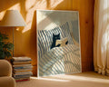
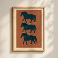
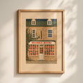
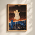
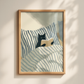
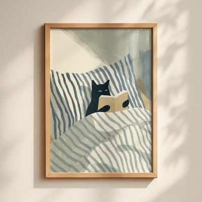
Art is one of the easiest ways into the style, because a single well-chosen piece sets a tone the rest of a room can follow. Japandi wall art tends to carry the same values as the interiors it belongs to: restraint, natural subjects, a narrow palette, and a certain emotional stillness that asks you to slow down rather than react.

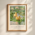
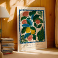
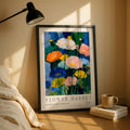
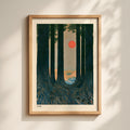
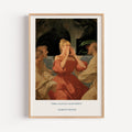
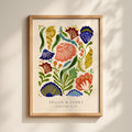
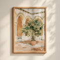
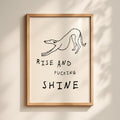
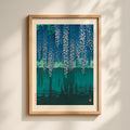
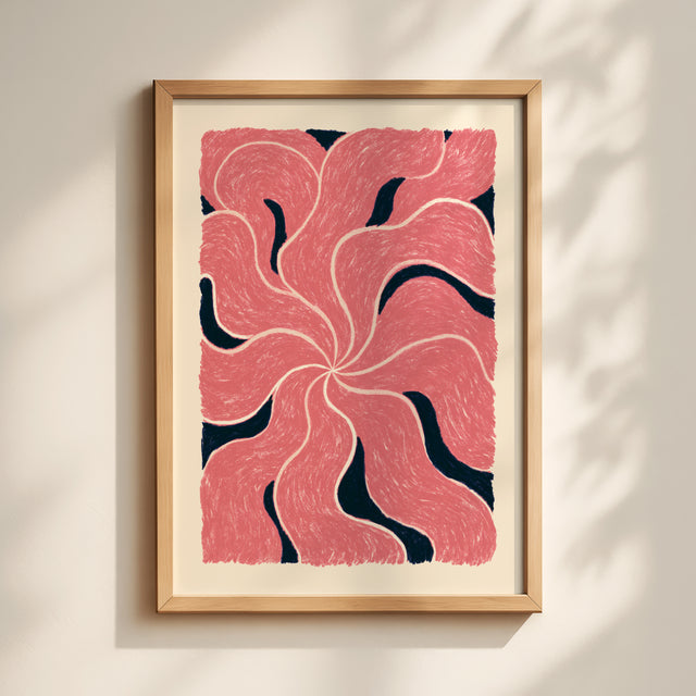
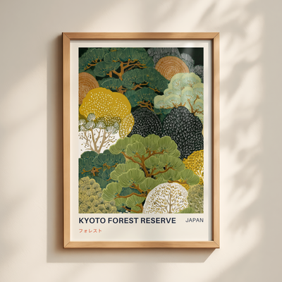
A few forms recur. Minimalist line art, where a face or a figure is caught in the fewest possible strokes, is a Japandi staple, and it sits within the wider family of minimalist wall art built on the same economy of means. Muted botanical studies, a single stem or a pressed leaf in soft, faded tones, bring the natural world indoors without tipping into anything ornate, which is much of what our botanical prints are doing. Serene landscapes, misty hills and still water and pale horizons, echo the Japanese reverence for nature and the Scandinavian hunger for light, and belong to the same register as our nature wall art. Soft organic abstracts, all rounded forms and gentle asymmetry in neutral tones, carry the wabi-sabi sensibility more directly than almost anything else, and fill a good part of our abstract prints.

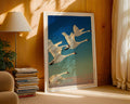
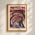
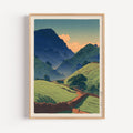
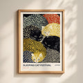
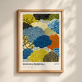
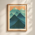
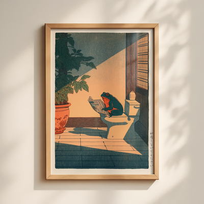
Then there are the understated Japanese motifs, the cranes and waves and mountains and brush-style marks that nod to the eastern half of the equation. These live in our Japanese wall art, which is the largest and most-loved part of what we make, and no accident that it should be: it captures the exact mood Japandi is built around.

What ties all of these together is not their subject but their reticence. Japandi art is defined as much by what it leaves out, the empty margin and the narrow range of color, as by anything it puts in.
How to bring Japandi into your home
You do not need to redecorate. Japandi rewards editing far more than buying, so a few considered moves go a long way.
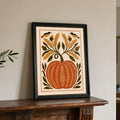
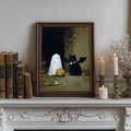
Begin with color, and keep your art inside a tight, earthy range so a print agrees with the wall rather than competing with it. Give each piece room, too; the style dislikes crowding, and a single larger print on an open wall usually reads as more intentional than a densely packed arrangement. Framing matters more than people expect: simple frames in natural wood or matte black suit the look, and a generous white border around the image reinforces the sense of space.
Above all, let warmth and quiet sit together. Balance the cooler, minimalist pieces with something softer or more textural, so the room feels lived-in rather than staged. That small tension, calm but warm, is Japandi doing exactly what it was designed to do.
If you want a shortcut, our Japanese and minimalist collections sit closest to the heart of the style, with botanical, nature, and abstract pieces filling in around them.
Japandi FAQ
Is Japandi on trend?
Yes, and it has outlasted most interior trends precisely because it is not really one. It draws on two long-standing design traditions rather than a passing fashion, and its emphasis on calm, natural materials and buying less but better has kept it firmly in favor well beyond the year it went mainstream.
What colors are Japandi?
A muted, earthy palette: warm whites, beige and oatmeal, clay and terracotta, soft grays, sage green, and gentle browns, usually grounded by a deeper accent such as charcoal or black. Restraint matters more than any single "correct" shade. A small, harmonious range of natural tones is the real rule.
What is the difference between Japandi and minimalism?
Minimalism is about reduction, stripping a space back to its essentials, often in a cool and sometimes stark way. Japandi shares that discipline but softens it. It brings in natural materials, warmer earthy tones, and the wabi-sabi appreciation of imperfection, so where pure minimalism can feel cold, Japandi feels settled and inviting.
What kind of wall art works best for Japandi?
Minimalist line art, muted botanicals, serene landscapes, soft organic abstracts, and understated Japanese motifs, all kept within a limited, earthy palette. The best Japandi pieces are quiet by design and leave plenty of space around the subject.
Bringing a little Japandi home
Japandi has endured because it answers something a great many of us quietly want from a home: a space that feels settled, warm, and unhurried. Art is among the simplest ways in, since the right print sets the mood for everything around it. If the style speaks to you, our Japanese wall art collection is the best place to begin, with our minimalist prints close behind whenever you are ready.